NASA Graphics Standards Manual, Reissued
The 1975 rebranding presentation gets resurrrected in hardcover form, exclusively on Kickstarter


The tale of
NASA’s two logos recently resurfaced, bringing to light a battle won, or lost—depending on who you speak to. During the Nixon administration, US government agencies were pushed to undertake visual makeovers through the “Federal Design Improvement program.” This eventually led to NASA’s rebranding, with a minimalist red logo (nicknamed the Worm) created by designers Richard Danne and Bruce Blackburn. If the sleek rendering doesn’t look familiar, it’s because the change didn’t stick: after almost two decades, NASA reverted back to its original blue “Meatball” insignia.
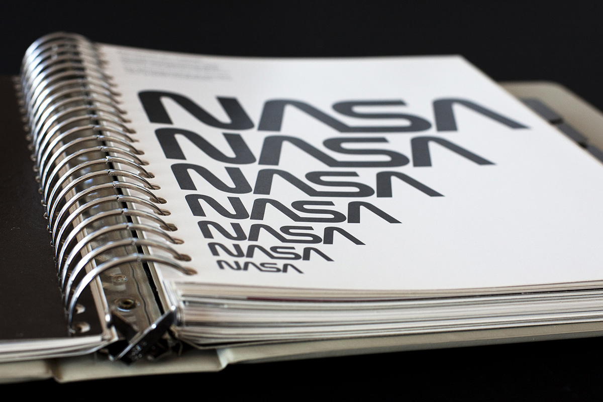
For graphic designers (and admirers) who’ve mourned the Worm’s passing, however, there’s some particularly joyous news. The 1975 NASA Graphics Standards Manual created by Danne and Blackburn will be reissued in a hardcover form to the general public—scanned directly from Danne’s personal copy. This ring-binder of pages introduced the Worm logotype and included “instructions on designing every aspect of NASA’s new identity”—from color swatches and uniform patches to vans and spacecraft. If this sounds familiar, it’s because it’s the same duo (Jesse Reed and Hamish Smyth) who successfully reissued the New York City Transit Authority Graphics Standards Manual, a 1970 graphic design treasure created by Massimo Vignelli and Bob Noorda that would shape the visual NYC subway experience for riders.
The 1975 NASA Graphics Standards Manual reissue will only be available via Kickstarter—already surpassing its goal on day one—but you still have more than month left to reserve your hardcover. There’s only one reward, and it costs $79.
Hardcover rendering courtesy of Jesse Reed and Hamish Smyth, binder image courtesy of Danne and Blackburn